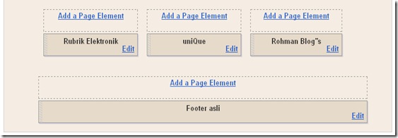
Hi guys? Meet again with me on Blogspot tutorial. This time, I would like to share my trick and tips to make multi column on blogger template. Like in wordpress, maybe you ever see any footer column which split into 2, 3, or even 4 parts. The question is, “do we can make the same thing in Blogger?” Of course we do. It will be very easy to build. Do you want to know more? Read it till end!
To make footer part become one column, it isn’t difficult as you imagine. But, you need a little trick to make the footer blog have multi column. To make you understand, I advise you to try it. Make a new blog for this little experiment (don’t do it on your main blog). In order to avoid any accident that might be happen..
First preparation that we need to give attention most is, width of our column that will be split into multi column, quantity of column that we going to make, space between one column to another column. But, templates in Blogger are so much. To make a deal with those problems, let’s use template Minima. Minima is original template that provide by Blogger with optional color white. Number of column that we are going to make is three column.
Original Minima template has 660 pixel column widths. We are going to make three columns, if we calculate it : 660px divide by 3 = 220px. With space (code to make space is padding) between column is 10px. Based on result of my calculation, column that we will make is 205px.
This is the steps to make multi column on blogger template :
Step 1:
- Don’t give a tick on white little box beside sentence, “expand widget template”. Or it will be twice more difficult.
- Add the code below exactly above code ]]>
/* bottom==================== */#bottom {
width: 660px;
position: relative;
clear:both;
margin: 0 auto;
color:#fff;
float: left;
background:#BDBABD;
padding: 15px 0 15px 0;
}#bottom h2 {
padding: 5px 0 2px 0;
margin: 0 0 10px 0;
color:#ff5a00;
font-size: 24px;
letter-spacing: -1px;
border-bottom: 1px solid #fff;
}#bottom ul {
padding: 0;
margin: 0;
}#bottom ul li {
line-height: 26px;
list-style-type: none;
border-bottom: 1px dashed #031c5d;
}#bottom ul li a {
display: block;
padding: 0 10px;
color:#0701FD;
text-decoration: none;}
#bottom ul li a:hover {
background: #B1ACB1;
}#left-bottom {
width: 205px;
float: left;
padding-left:10px;
}#center-bottom {
width: 205px;
float: left;
padding-left:10px;
}#right-bottom {
width: 205px;
float: left;
padding: 0 5px 0 10px;
} -
Head to body under part of template code. Find out codes like this:
-
Copy and paste code below exactly above of the previous code.
-
Click Save Template Buttons.
-
It’s done!
Step 2:
- Click Page Element tab.
- Are your new columns already become three?
If it hasn’t success yet, you must be missing something. If you already success, congratulations on you.
Well… do you want to see the examples? Just click here! Or, you can see at the bottom of this page.
Good luck!

0 komentar:
Posting Komentar